Thursday, March 24, 2016
Review: Carrie Moyer’s Conflagration of Canvases
Ms. Moyer explores the push-pull of potential opposites in an exhibition of new paintings at DC Moore.


Wednesday, March 23, 2016
Song Exploder: Ride to ‘American Valhalla’ With Iggy Pop and Josh Homme

Tuesday, March 22, 2016
MIMA Light is a small prefabricated house raised up from the landscape on a near-invisible base
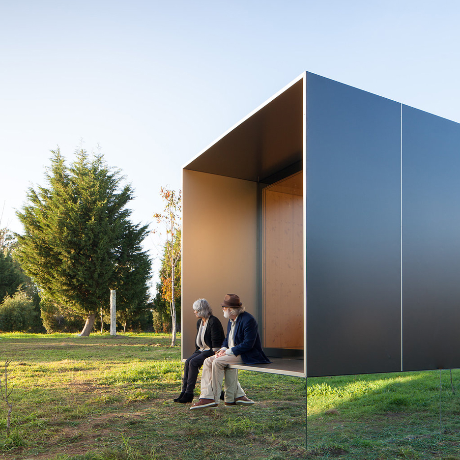
The architects behind a prefabricated housing company have completed one of their smallest buildings so far – a cuboidal property raised on a mirrored plinth above a grassy Portuguese landscape (+ movie). (more…)
Friday, March 11, 2016
Fit City: With Black Ops Laser Tag, Going to War (and Off the iPad)
The game, as in an 8-year-old’s birthday party at Indoor Extreme Sports in Queens, gets players off the couch and on to a bloodless battlefield.


Wednesday, March 9, 2016
Adobe Muse CC goes responsive
 Last month Adobe released an update to Adobe Muse CC, a popular visual web design tool that allows you to create websites without code. This new, powerful tool is included with the Creative Cloud.
As a traditional graphic designer, Adobe Muse opens new doors allowing you to work in a familiar interface, à la Adobe InDesign, for creating websites. A limitation of the application previous to this update was being locked into fixed-width layouts. Muse has supported adaptive design for some time and added a text-synching feature for easier management across alternative layouts, but was missing the critical component of responsive design. Now you have a choice—you can decide which approach (responsive or adaptive design) is best for your specific project.
How it works
When creating a new site, the option is front and center. Adobe redesigned the New Site dialog box giving you the option to create a fixed-width layout or a fluid width layout.

The obvious choice for responsive design is fluid width. Nothing has changed in the Plan Mode, but once in the Design Mode there’s a new interface feature specific for responsive design: the breakpoint bar. This workflow is similar to what Adobe offered in Edge Reflow and more recently Dreamweaver with its Bootstrap features.

Adding breakpoints
Adding breakpoints in Muse is simple and intuitive. On the right-hand side you will see a scrubber that allows you to resize the width of the page, simulating a browser resizing.

The idea is to add breakpoints when your design “breaks”, which could be elements overlapping, getting too small, or whatever the case may be. Ideally you would separate the idea of adding breakpoints for specific devices, and strictly focus on what the design requires. It’s really a balancing act; the main support for responsive design is to accommodate a wide range of screen sizes due to the proliferation of mobile devices. This is where being thoughtful and doing a little bit of planning can go a long way. You can add as many breakpoints as needed. Just be mindful that the more you have, the more you’ll have to manage.
To add a break point, you can click the small plus sign that appears on the breakpoint bar.

Once you add the breakpoint, the breakpoint bar becomes color-coded. You can manage breakpoint properties by right-clicking on the breakpoint bar and choosing the breakpoint properties option.

This will open the breakpoint properties dialog box. Here you can control specific properties, from the color and/or position of the breakpoint to adding column guides to appear for that breakpoint. Everything in this dialog box is specific to the current breakpoint and has no impact on any other breakpoints within the page.

You can quickly navigate between breakpoints by clicking on different sections within it. On each breakpoint you can begin to reformat the content to make better use of the browser width.
Master pages
Master pages have their own breakpoints, which respond independently of the pages they are applied to. This gives you specific control over the master page content, typically a header and footer.

These breakpoints appear on the breakpoint bar as small triangles, to indicate where the breakpoints are in the master. You can click on the triangles to quickly position the scrubber to that location.
Formatting content at breakpoints
When you add a breakpoint, you can reflow the content any way you’d like. Often times you’ll take an approach where you stack content, or resize the content so it’s larger making it easier to view on smaller screens. It’s not uncommon to show less content. As the screen gets smaller the content should get more specific. In the example below, you’ll notice that I went from a three-column layout for the larger breakpoint to a two-column layout for a smaller breakpoint. The images and text become larger, making it easier to view on a smaller screen.

There are a couple of important things to keep in mind. First, if you want less content to appear, you should not delete the unwanted content at the smaller breakpoint. You have to remember that this is one page; it reflows to change its layout for various screen sizes, but it’s still one HTML document. So deleting it at any given breakpoint deletes it from the page. Instead you can hide the layers for the content on a specific breakpoint, or right-click on the element and choose Hide on Breakpoint. This will make that piece of content invisible at the selected breakpoint, but unaltered on others.
It’s also important to understand how content re-sizes in Muse when working with this responsive feature set. By default, elements you create in Muse will scale width-wise. Elements placed into the document, like an image for example, will scale the width and height proportionally. You can control these settings in the control bar when an element is selected.

A behavior you might encounter is objects “floating” a bit when the browser window is being resized. For these circumstances, Adobe has added a new option called Page Pinning. This is not to be confused with the Browser Pinning options available in previous versions, which would “pin” an element to the browser; if the user scrolled down the page, the pinned element would stay locked into position with content scrolling underneath it. Page pinning is a bit different. The element that is pinned using this option will still scroll with the browser, but if the element is located in the center of the page regardless of what the browser width is, the element will stay locked to the center of the page, albeit still scaling in size when the sizing properties are set as such.
Migrating a site to responsive
If you’ve worked with Muse in the past, and have a fixed-width site, it is possible to migrate it to a responsive layout. What’s important is changing your site properties. To do this, select File>Site Properties to open the Site Properties dialog box. Here you can change the layout from Fixed Width to Fluid Width.
Next you need to change attributes of the elements that you want to be fluid. You can do this by removing any previously established pins. You should then right-click on the object and select resize. This will give you various responsive options to select from.

Conclusion
There are few things that aren’t ready for “responsive primetime” in Muse. Scroll effects are not supported just yet. Which means if you need to use these types of effects, you’ll be stuck with an adaptive solution for the time being. Also, not all widgets are responsive either, though the folks at Adobe are working on it and I would expect both of these limitations removed with future updates.
The new responsive feature set in Adobe Muse CC is a welcome addition to an already powerful visual web design tool. It offers designers the ability to create responsive content visually and in an environment that is intuitive and familiar.
Convert Photos to Stunning Paintings with Digital Painter – only $9! |  |
Source
Saturday, March 5, 2016
LA Web Design Company
Los Angeles Web Development Agency
If you are looking for a the very best digital marketing agency in L . A . you found the proper site for Los Angeles SEO Expert. Focuses on fantastic web site design in lots of areas. They cover every one of the local LA niches searching traffic. So if you feel wanting your website to rank looking engines give them a call. This term is generally called SEO or search engine optimisation. Finding the right web page design agency could be a very tough task. There are so many companies to select from. Don't be fooled by companies that are not wanting to meeting directly. They'll likely could be an oversee company. When choosing your ecommerce design think of the term less is much more. Be precise on which and where you would like people to click. The most important thing you want to take a look at, apart from the web site design, is the hosting. You want to make sure you are receiving a server that is located nearest for your requirements. In this case, we may want to discover a marketing company in Los Angeles, California. You would like to make sure you buy the highest package you really can afford, to ensure way it can handle potential high traffic. We will not end up in seo here, however, this a something you will need to discuss using your design company. Should you it right you will observe an increased variety of organic traffic, which can be prefered. That's how you will make money with your internet store. The next phase is branding and company logo. This can be a crucial step advertising online and if you plan to succeed online employ a professional.
Los Angeles Web Design
Starting a website in LA can often be difficult. First, you need to register your internet site with GoDaddy. In La, you just go into GoDaddy and you also type in the domain you need it go and see a old registration process secondly you need to ensure that you've a hosting account with Hostgator. If you see a hostgator website backslash shared hosting get you this page and you will can suggest for certain plan with unlimited domains of an Space Odyssey you can you know what with a vast quantity of sites on the same shared enviroment plan using them. It is really slow but he doesn't want to go to do multiple for a passing fancy plan or items to get for you expensive so.
Los Angeles SEO Expert
Time for Hostgator you have a message with your email that would present you with your cpanel the venue to help you sign in through the web los give you your username/password your domain server is all that stuff. I willshow you are very obviously but you get yours inside the mail and that means youobtain that information handy so one thing we are going to have to do if we get our hosting for web design account setup and our domain registered may be the change our name servers to forward to. You will get An email with the information that can be done this from Hostgator we enroll in a merchant account there so just name service from that email on we to go forward and signing in to GoDaddy to sign in or going to attend domains and domain management.
Subscribe to:
Posts (Atom)